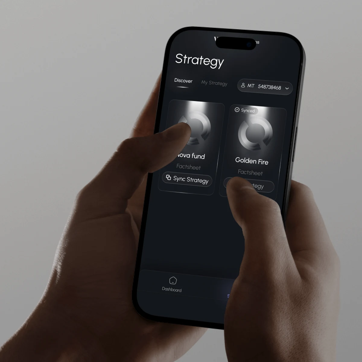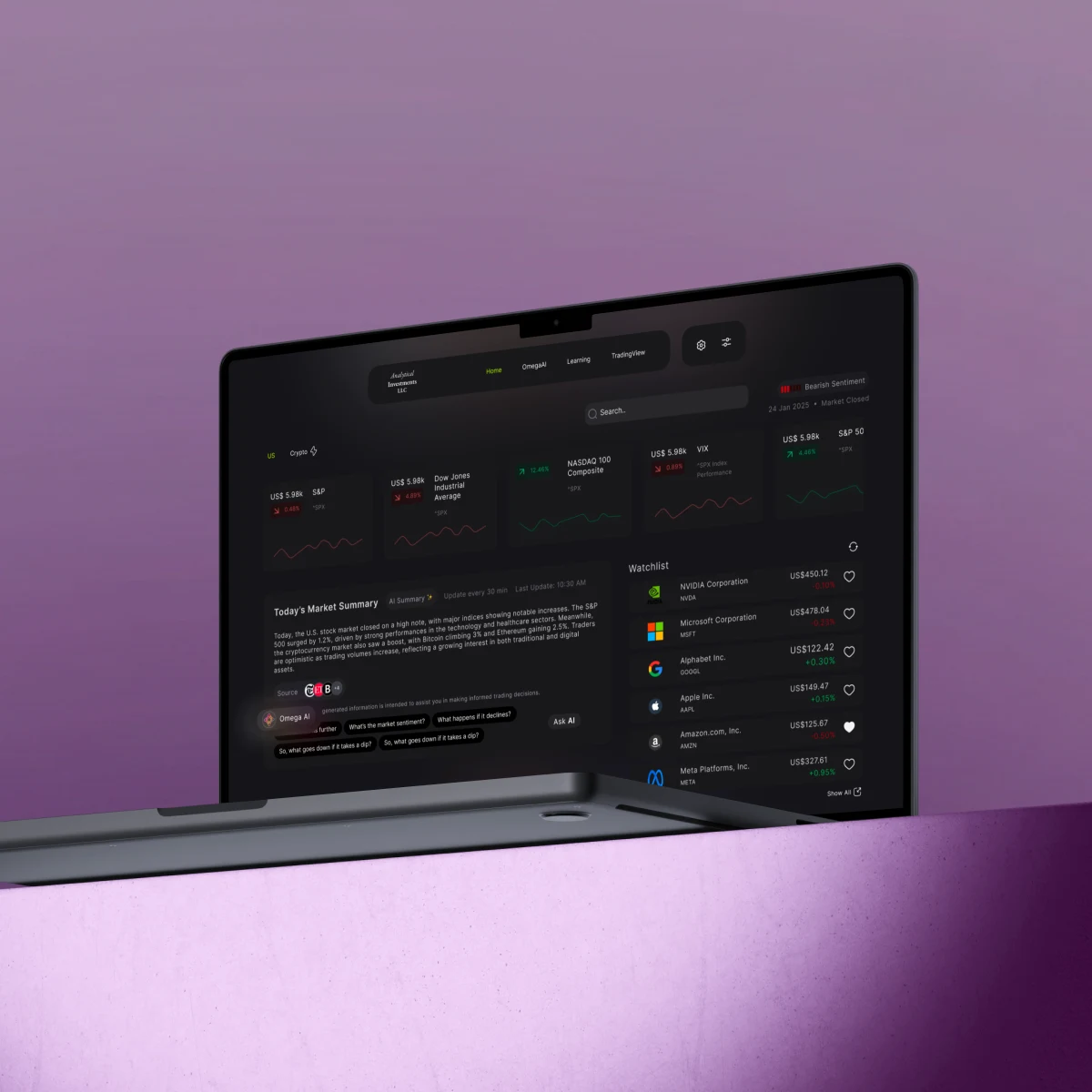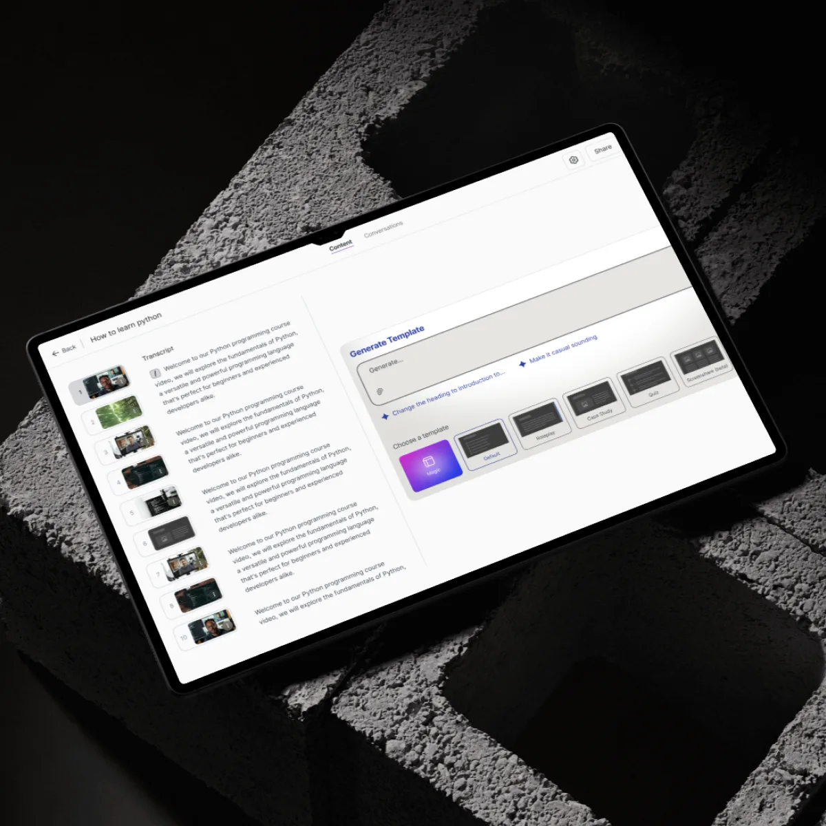
A cross-platform copytrading experience across mobile (iOS & Android) and web, designed to balance real-time trading insights, compliance requirements, and ease of use for both new and experienced traders.
View live product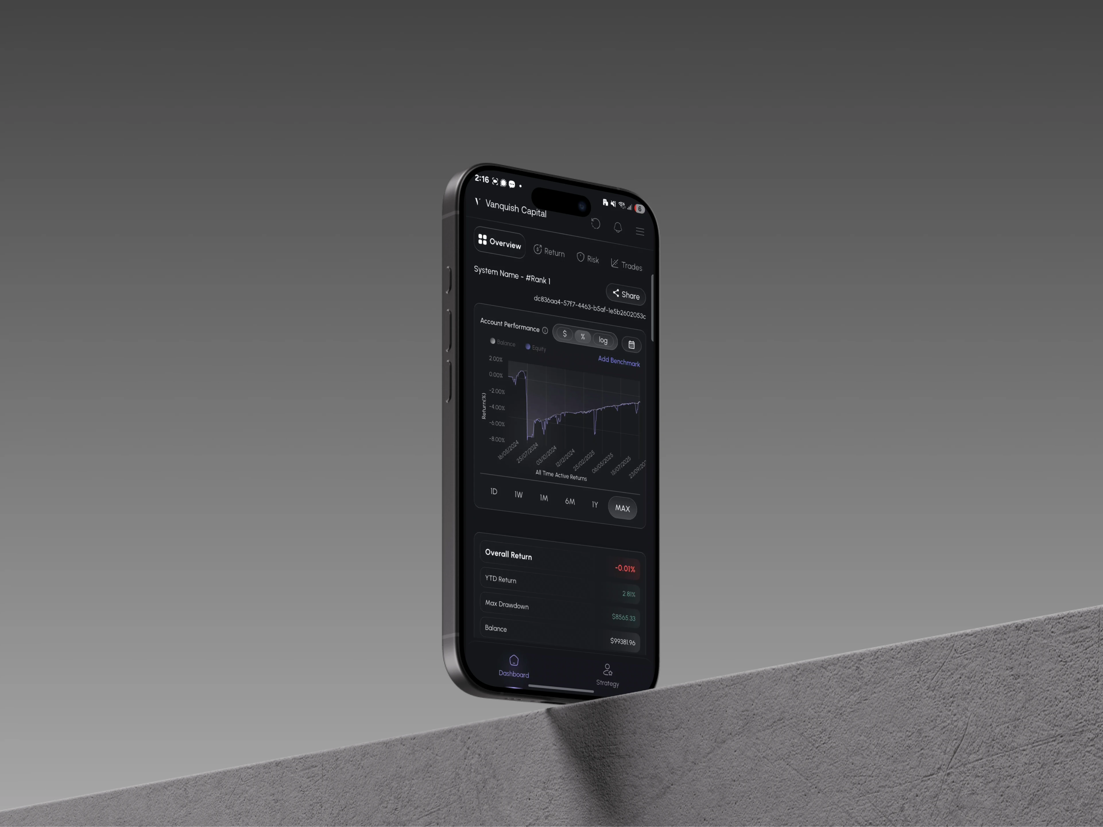
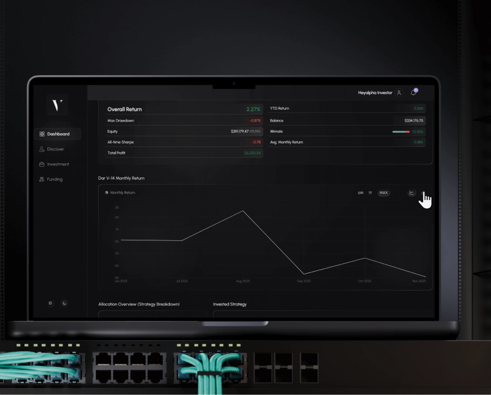
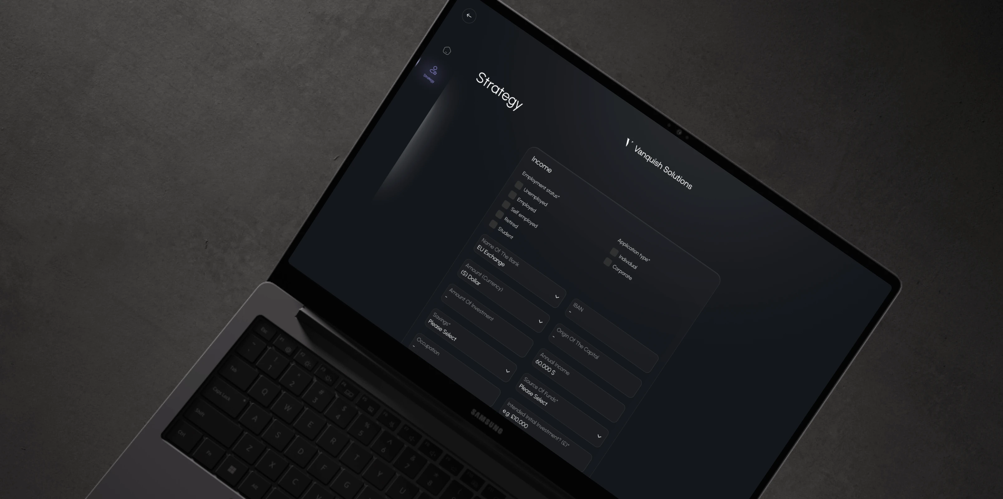
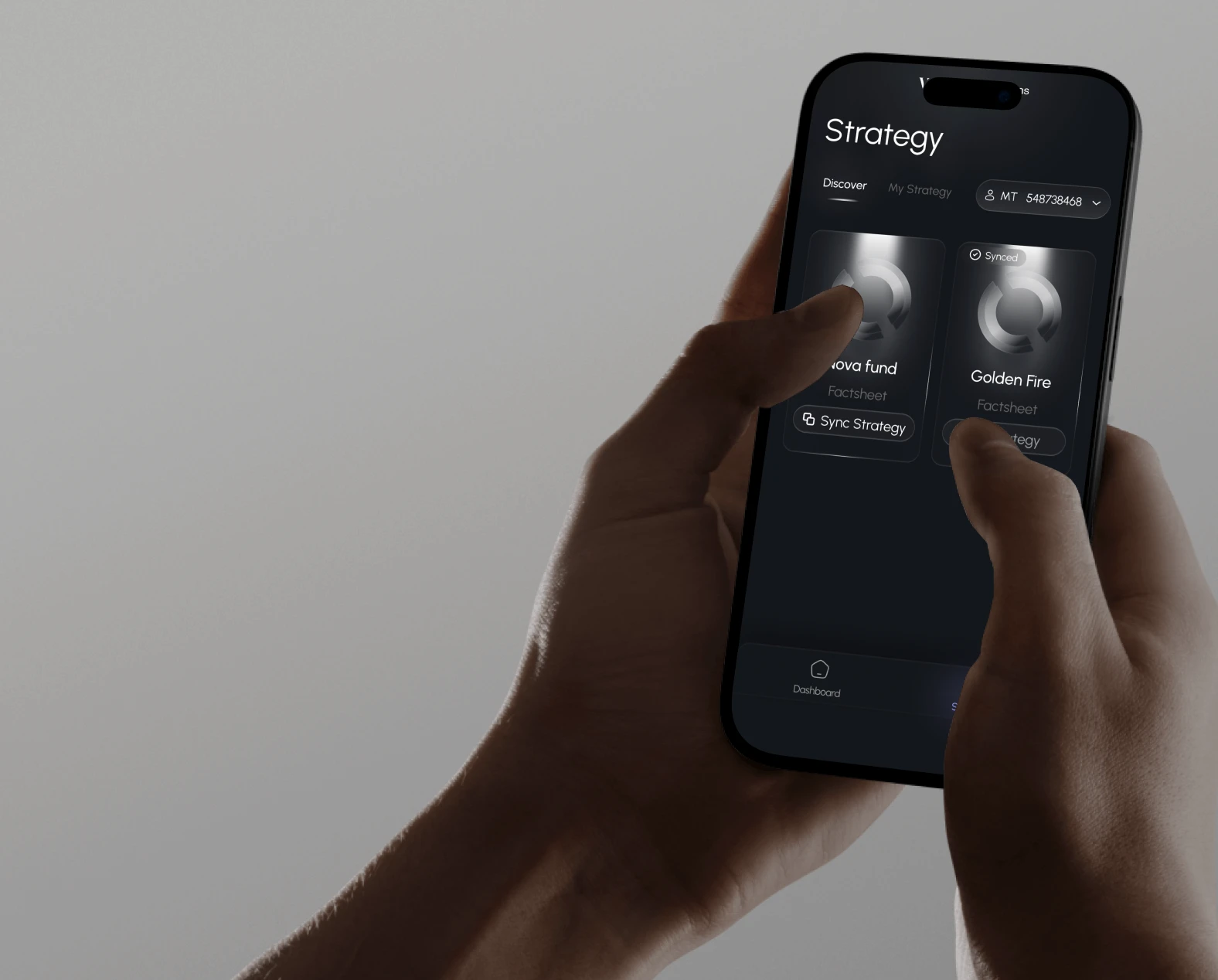
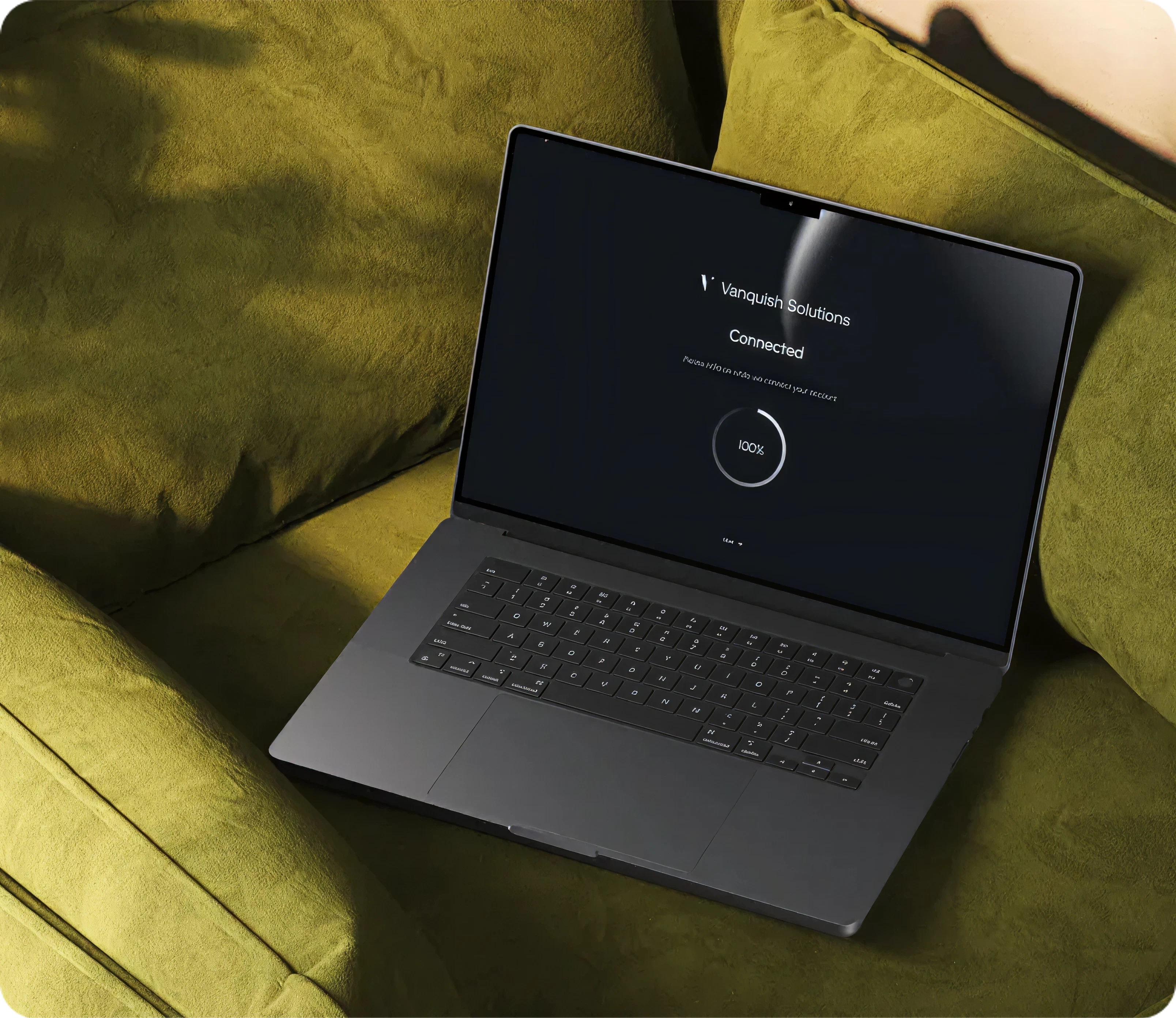
Vanquish is a copy trading platform designed to help new and growing investors follow expert strategies with confidence. We partnered with Vanquish Solutions to design a cross-platform experience across mobile and web, focused on making copy trading clear, usable, and reliable.
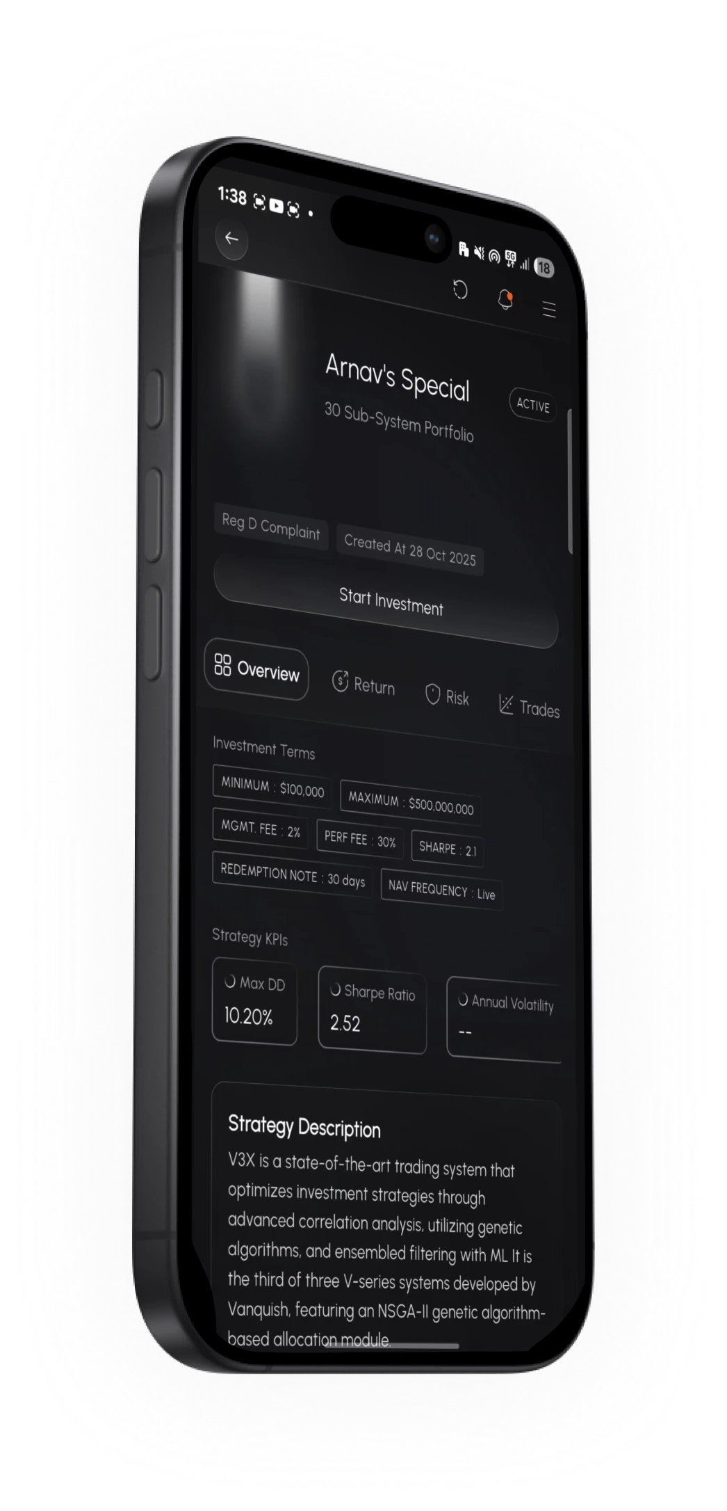
The existing product experience lacked the clarity and structure expected from modern trading platforms. As the product expanded to support both B2B and D2C use cases, the design system and workflows began to limit scalability and usability.
Overloaded strategy pages filled with raw data made it difficult for users to evaluate performance.
Poor UX hierarchy in the legacy desktop experience created confusion across core workflows.
Balancing simplicity for first-time traders with depth for experienced users was unresolved.
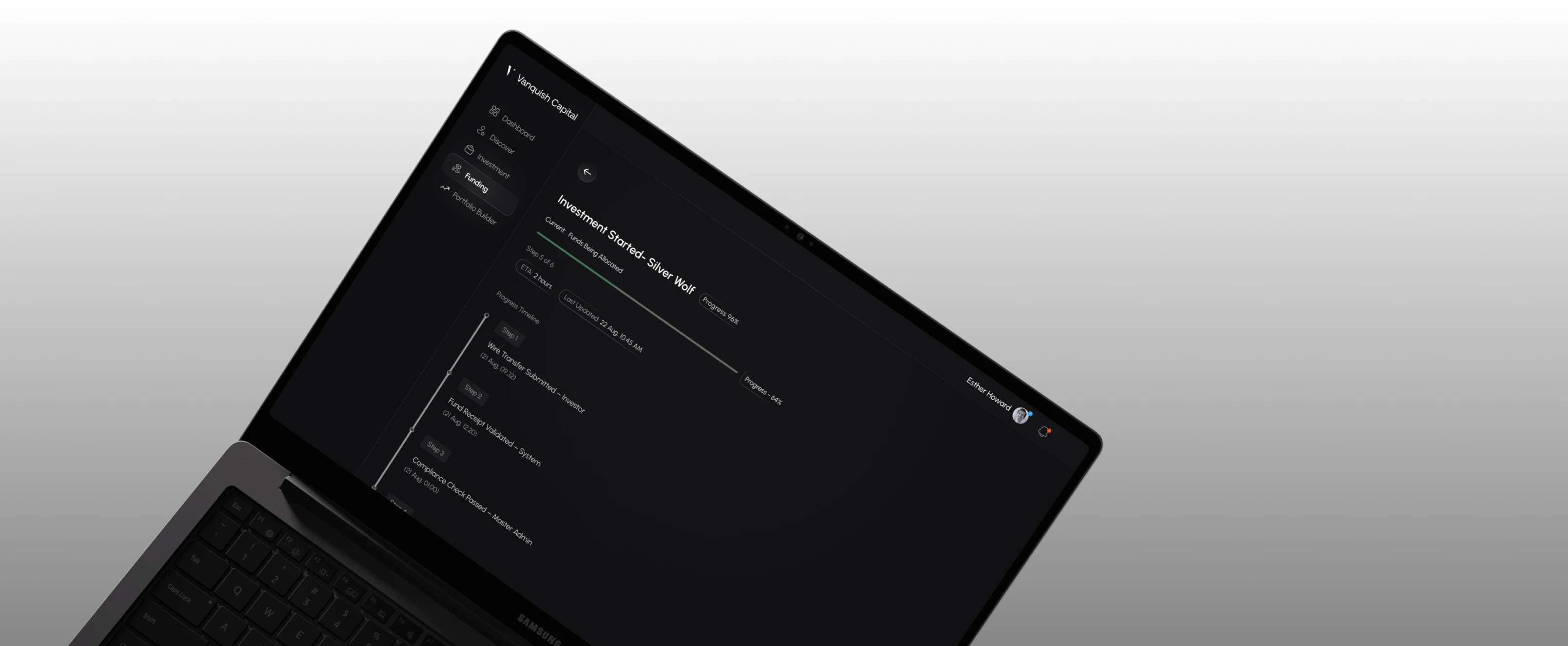
Integrating legal and compliance flows without disrupting the core experience was a key friction point.
Designing shared patterns across mobile and web without duplicating logic proved difficult.
Preparing the platform for future white-label and multi-brand deployments required a scalable system.
An intuitive experience across devices
Design trading workflows that feel clear and easy to use on both smaller and larger screens, ensuring a consistent experience across mobile and web.
A modern finance-grade design language
Replace legacy patterns with a clean, minimal visual system that feels trustworthy, contemporary, and built for long-term use.
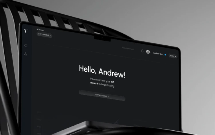
Compliance without friction
Integrate KYC, legal disclosures, and regulatory requirements in a way that feels clear and necessary, without interrupting the core trading experience.
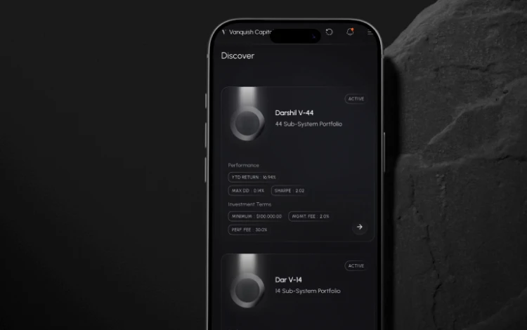
Clear strategy discovery and evaluation
Enable users to explore, compare, and follow trading strategies with confidence, without overwhelming them with data or options.
A scalable and modular UI system
Create a flexible design system that stays consistent across platforms while supporting future growth and white-label deployments.
This project began with deep research and careful exploration. We studied leading trading platforms across the UK and US markets, examined how users interact with financial tools, and reviewed existing patterns across mobile and web experiences. Alongside competitive analysis, we conducted primary research to understand real user needs, constraints, and expectations. Rather than following a rigid framework, we shaped the process around what the product needed at each stage. This allowed us to move deliberately through research, exploration, and execution while keeping the design flexible as the platform continued to evolve.
1.
Discover
Understand user workflows and the business context through research and observation.
2.
Define
Turn insights into clear problem statements, goals, and success criteria.
3.
Ideate
Explore concepts and directions that simplify complex workflows and interactions.
4.
Design
Craft interfaces and systems with clarity, consistency, and intention.
5.
Deliver
Validate the work, refine details, and ship designs that are ready for real world use.
This project began with deep research and careful exploration. We studied leading trading platforms across the UK and US markets, examined how users interact with financial tools, and reviewed existing patterns across mobile and web experiences. Alongside competitive analysis, we conducted primary research to understand real user needs, constraints, and expectations. Rather than following a rigid framework, we shaped the process around what the product needed at each stage. This allowed us to move deliberately through research, exploration, and execution while keeping the design flexible as the platform continued to evolve.
01. Discover
Understand user workflows and the business context through research and observation.
02. Define
Turn insights into clear problem statements, goals, and success criteria.
03. Ideate
Explore concepts and directions that simplify complex workflows and interactions.
04. Design
Craft interfaces and systems with clarity, consistency, and intention.
05. Deliver
Validate the work, refine details, and ship designs that are ready for real world use.
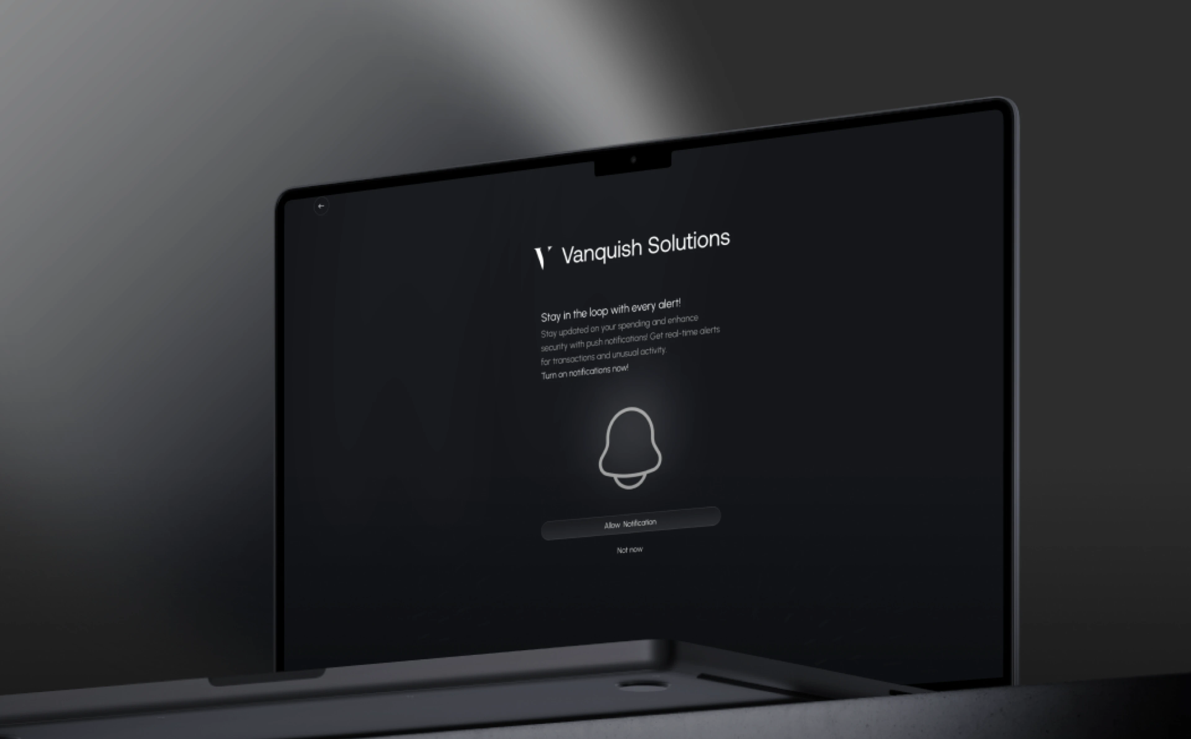
Copy-trading users span a wide spectrum from first-time investors seeking guidance to experienced traders monitoring performance at scale.
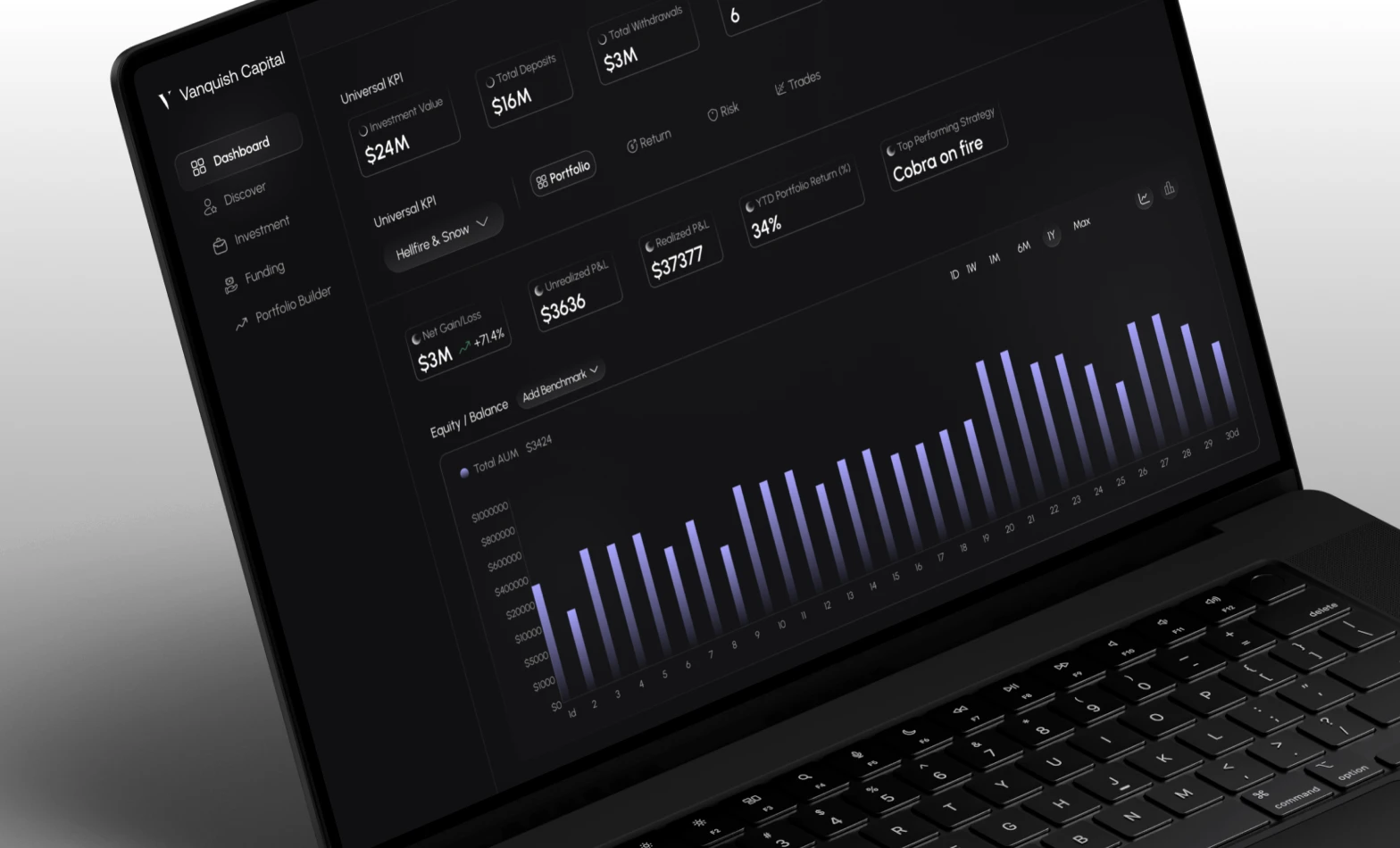
Strategy cards and detail views were designed with data-focused hierarchy, making performance easy to scan and compare.
We developed a clear understanding of how copy-traders interact with digital systems during their daily routines.
We developed a clear understanding of how copy-traders interact with digital systems during their daily routines.

Our UX strategy focused on structuring complexity into predictable patterns.
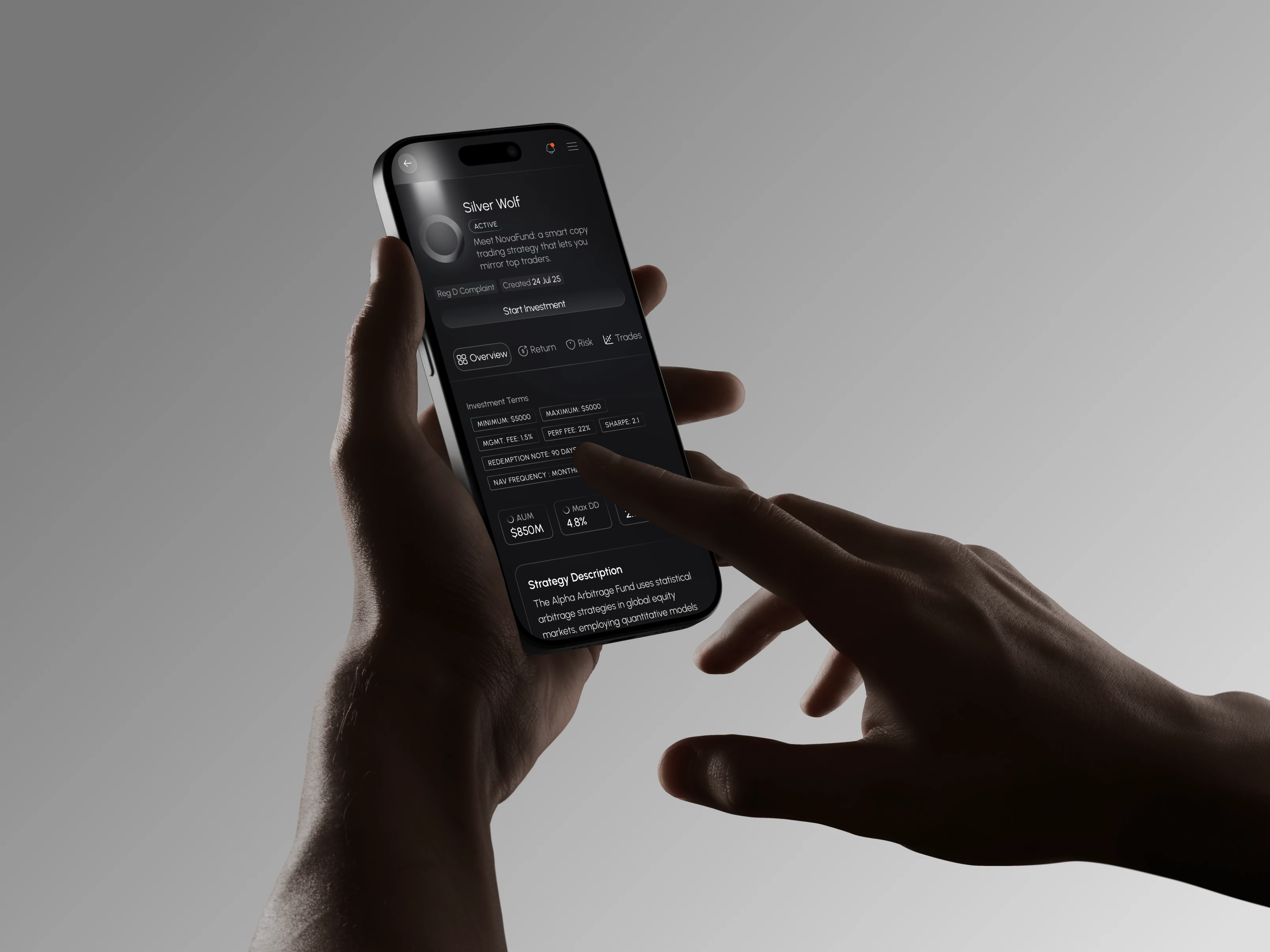
We restructured the platform's information architectureto align with real usage patterns.
The UI design emphasized clarity, restraint, and long-term usability. Finance platforms demand focus, not visual noise. We used calm color systems, structured layouts, and balanced contrast to reduce fatigue during long usage sessions.
Copy-trading users span a wide spectrum from first-time investors seeking guidance to experienced traders monitoring performance at scale. We identified the core experience gaps and designed targeted solutions for each.
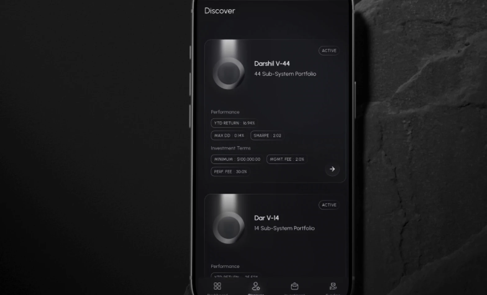
Making data-heavy strategy pages easier to understand
Strategy pages contained a large amount of data, which made it difficult for users to quickly understand performance and risk. We introduced clear visual hierarchy, progressive disclosure, and grouping of key metrics so users could scan, compare, and dive deeper when needed.
Reducing anxiety for first-time traders
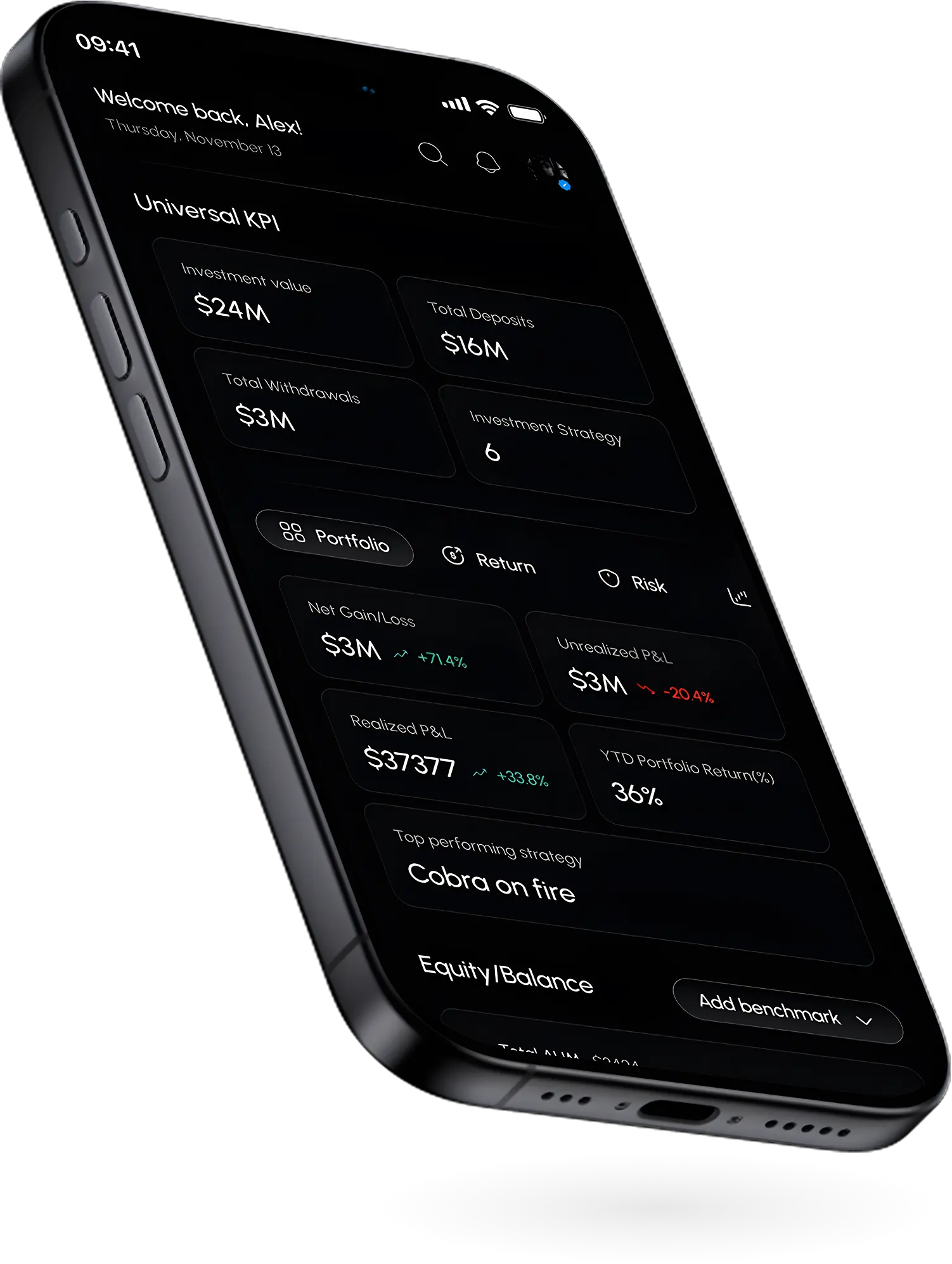
New users often felt uncertain when interacting with trading features for the first time. We focused on intuitive onboarding, simplified dashboards, and transparent performance indicators to help users feel more confident and informed from the start.
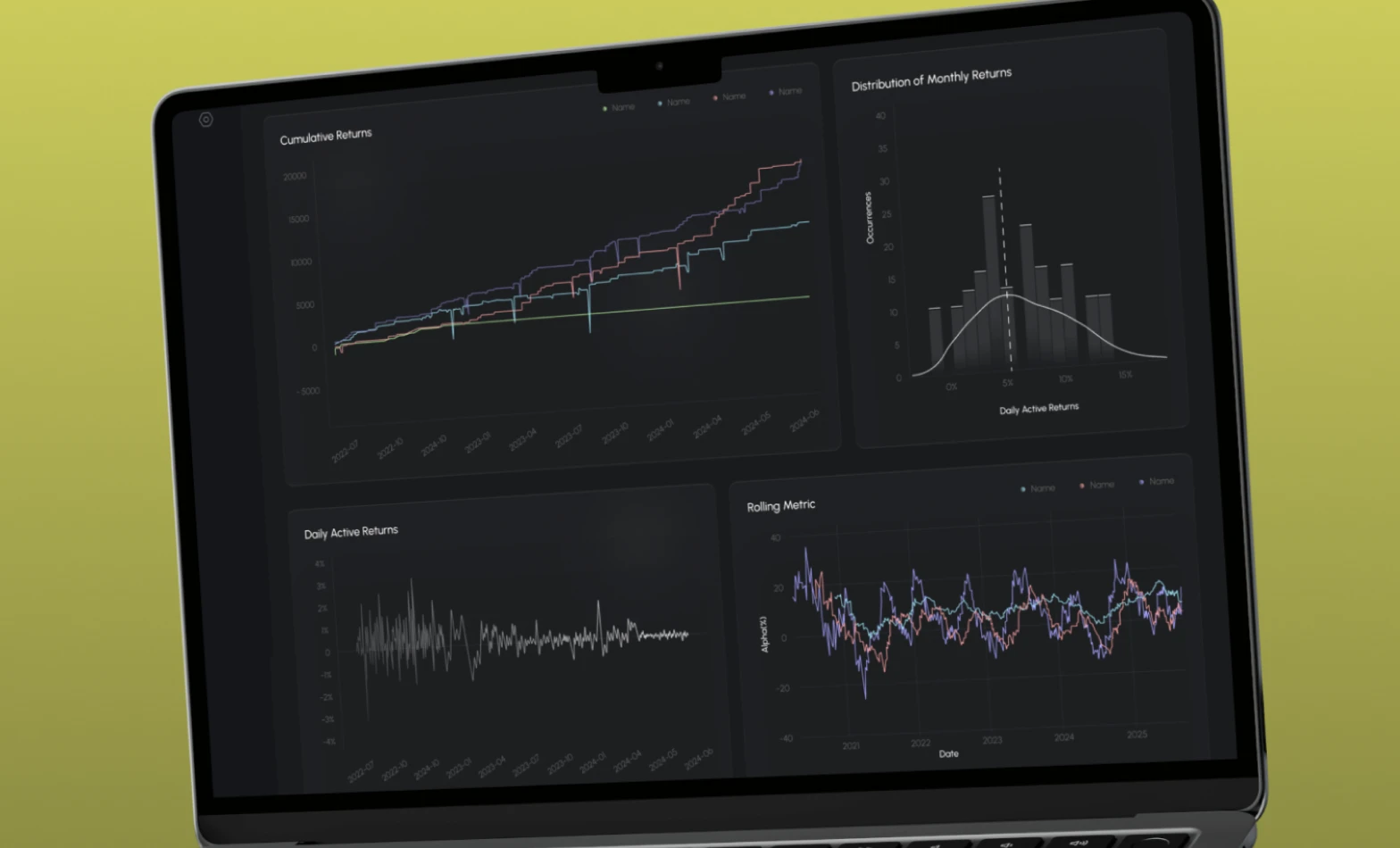
Maintaining consistency across mobile and web
As the platform expanded across devices, consistency became critical. We built a universal component system with adaptive layouts to ensure the experience feels familiar and reliable across both mobile apps and the web dashboard.
A project driven by clarity, scalability, and long-term platform thinking.
Designing the Anant Radio platform — a digital product experience for radiologists focused on workflow efficiency, clarity, and usability. A case study by Pencil and Screen.
See next case study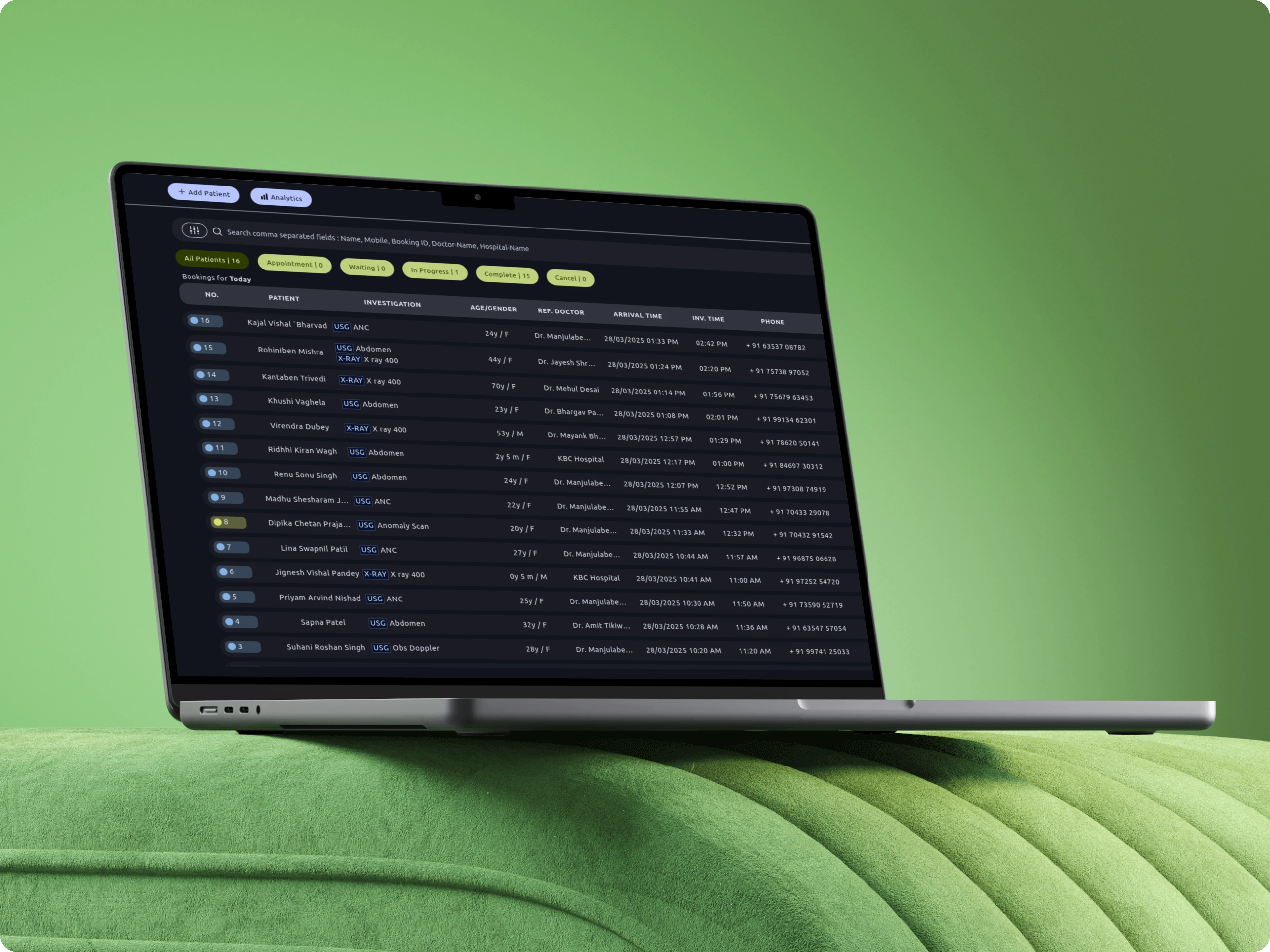
Whether you're building a product, shaping a service, or need focused design support, let's talk.
Share a few details about your project, product, or brand.
We'll get back to you within 24 hours.